CMS Implementations Deck
Section: Production: Design (16 slides)
- The images will load as you scroll to them. If you scroll too fast, you might get ahead of the loading.
- The permalink goes to the single page for a slide with “Prev” and “Next” links. It's suitable for bookmarking or sharing.
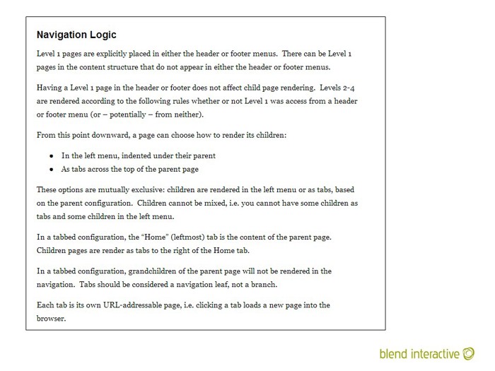
An example of navigation logic. Describing how navigation works in a narrative can be much harder than you think. Everyone assumes it just works, but it’s basically a set of rules that need to be settled on.
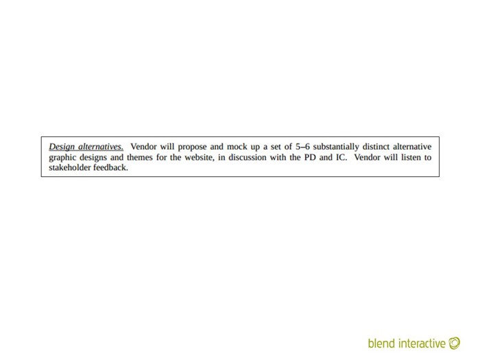
An example of what never to do. I bailed out of this particular RFP after reading this requirement.
Everyone will have their own ideas and try to remote control a designer. Everyone thinks they know what the organization needs.
Revisions have limited value. Very quickly, they will actually start making things worse.
Blend would write revision caps into agreements, but, in practice, Blend very rarely actually capped revisions. If a client genuinely wasn’t happy, we wanted to fix that. But on the rare occasions that we did put a stop to endless revisions, we were usually doing the client a huge favor.
After the first or second revision, designs rarely get much better.
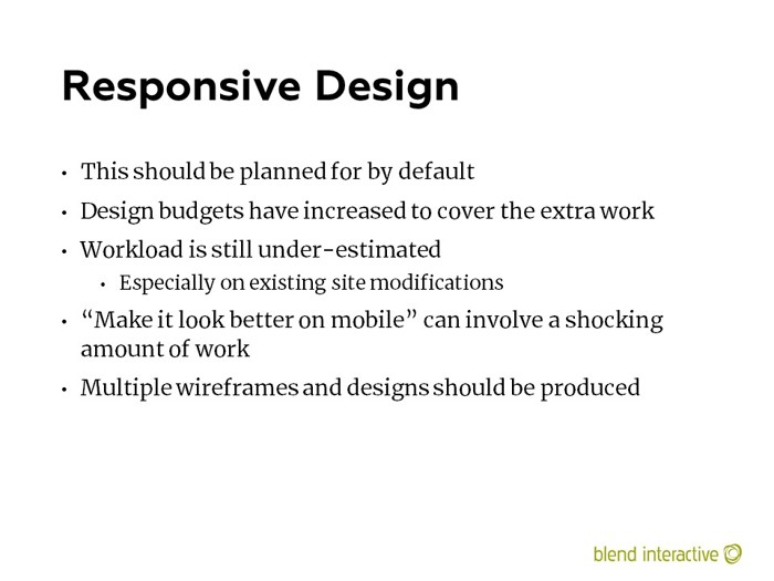
In 2014, responsive design was still pretty new.
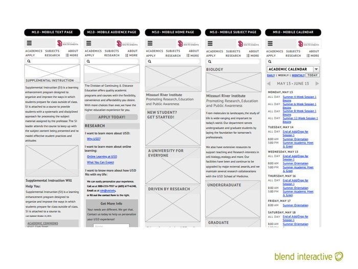
An example of mobile wireframes that go along with the main wireframes. In 2014, this was novel. Today, it would be completely expected.

Browsers have gotten so much better, and newer versions will penetrate the market so much faster. Microsoft’s adoption of Chromium will be a huge benefit for everyone in this respect. (Though it may be problematic for other reasons.)
