CMS Implementations Deck
Section: What Makes a CMS Implementation Expensive? (35 slides)
- The images will load as you scroll to them. If you scroll too fast, you might get ahead of the loading.
- The permalink goes to the single page for a slide with “Prev” and “Next” links. It's suitable for bookmarking or sharing.
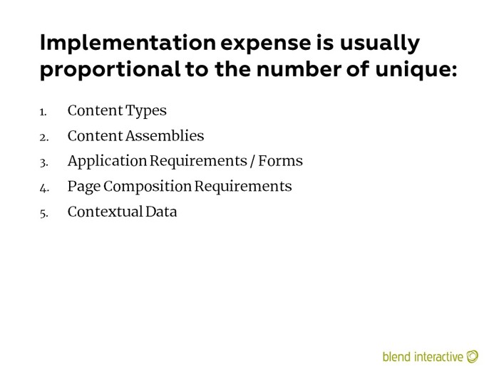
I stopped using the term “content assembly” and switched to “content aggregation.” This is the idea of grouping content to provide more value (think menus, categories, navigation, etc.)
I wrote a lot about aggregation in The Art and Practice of Content Assembly: Where IA and CMS Meet (obviously, I was still calling it “assembly” there). More recently, I wrote about it in the chapter about implementing the back-end of a CMS in the Web Project Guide.
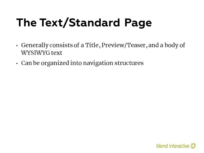
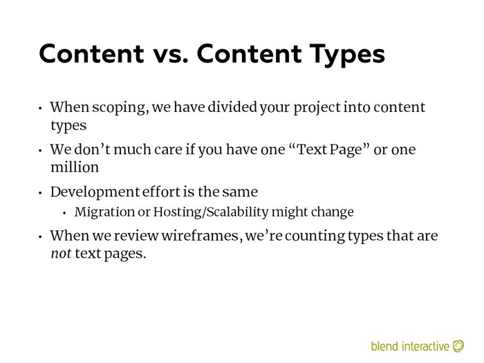
Every project has a “Text Page” of some kind. It’s the most basic content type, and often the type that others are based from.

An example of a “Text Page” content type. It has a title and a body of rich text. Every project has one of these. When scoping, we’re mainly interested in things that aren’t a text page.

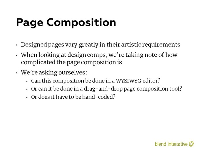
This was animated in the deck. This scrolled down through a fairly sophisticated landing page, which was pretty complicated by 2014 standards. This was a page that would need to be composed, rather than templated.
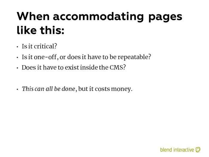
The “repeatable” bit is critical. We would often get wireframes that, it turned out, only showed what could be done. They weren’t 100% prescriptive, just suggestive of other functionality. They were intended to represent one possible configuration of the page. You need to explicit about these.
Are you saying, “Make me exactly this!”
Or are you saying, “Give me a set of elements so I could make something like this!”
Recently, some visual builders are providing very impressive demos around highly-visual content. But they’re basically just canned effects, into which you can plug some custom data. I suspect they’ll get repetitive and derivative fairly quickly. If a lot of people start using them, we’ll just see the same effects/themes on a bunch of websites.
Page composition changed the way projects were planned. Content modeling moved from the page to the element level, and templating was about enabling ways to combine elements to form a larger whole.
But not every page needs to be composed. Simple templated content still has a place, and, honestly, editors don’t want to compose every page. It would get tedious, and they would have the lingering worry that they were just repeating the same layout combinations over and over. If you wanted to change that, you’d need to do it everywhere – people talk about “content re-use,” but for some reason, they don’t put much value on “presentation re-use"…which is another name for templating.
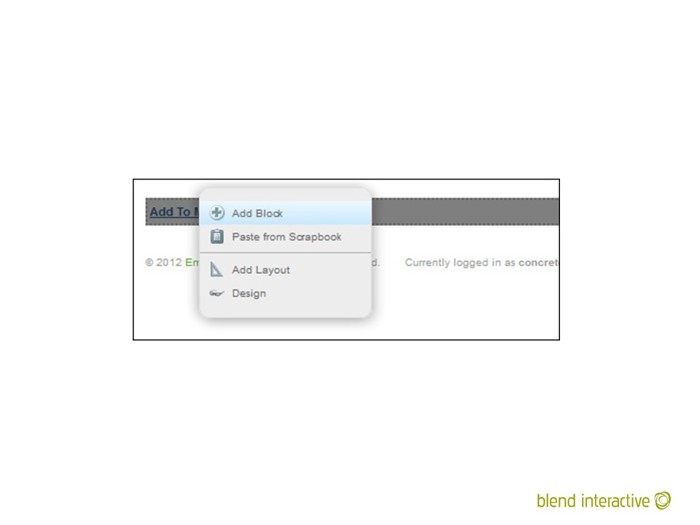
An example of a page composition interface from concrete5.
Again, I moved to the term “content aggregation” in my book and my other writings.
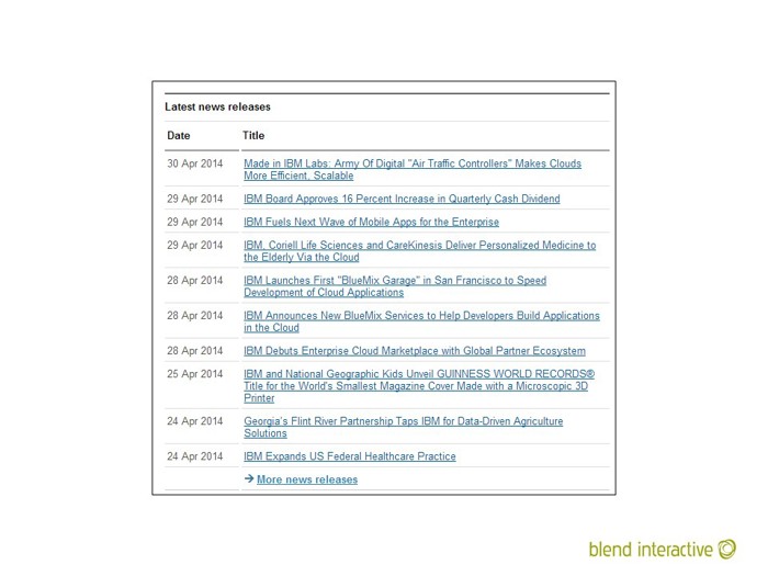
An example of an aggregation. Those are all individual content objects, grouped together into a simple list. This was likely a pre-configured search of some kind, ordered by date in reverse.

Another example of an aggregation. This is a little different in that the ordering is arbitrary – a human placed these tiles in that specific order.
This is some of the Blend team, incidentally. Good people (except that one guy, top row, second from left – don’t trust that guy).
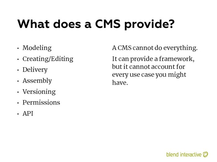
Naturally, these are content-focused functions.
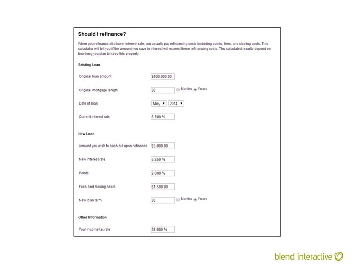
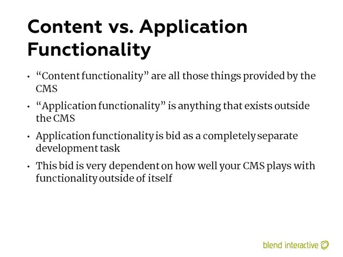
An example of a mortgage calculator that has nothing to do with your CMS. No feature in your CMS would make this easier or harder to build. This is functionality that exists totally outside your CMS.
I wrote extensively about CMS forms in The Truth About CMS Form Builders.

A simple contact form which is appropriate for a CMS form builder.
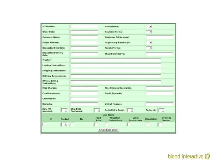
This would be very bad to attempt in a CMS form builder. This is complicated, and probably has significant workflow or process automation behind it.
Besides – how would your CMS help with this? What about this would be made better by building it in a CMS?
Some people might want to edit the form and move fields around, but when it comes to form builders, you need to understand that there’s another process the form submits to, and it expects specific data. If an editor decides to change the data that a form expects, they might very well break the process behind it.
For something like the above, the visual form is just a UI to a larger process. Just because you can change the UI doesn’t mean you can change everything else.
Again, see The Truth About CMS Form Builders for more on this.

Context is when elements on a page need to reconfigure or change their functionality based on the content being displayed. This happens all the time, and the rules behind it can get very complicated.
I changed my verbiage here from “core content” to “the operative content object,” but the idea is the same.
“Death by Sidebar” refers to the occasional designer habit of just throwing a bunch of stuff into the sidebars, without some thought as to where it’s supposed to come from.
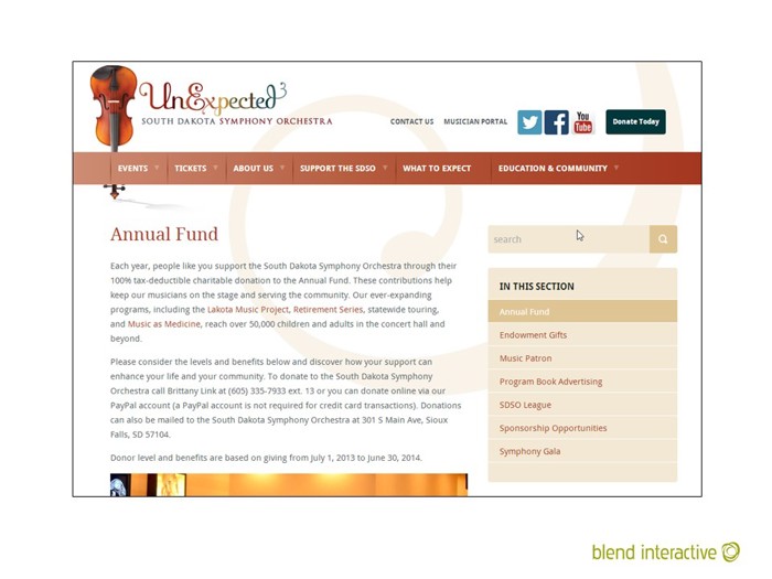
This would be a discussion of context. That menu on the right needs “context.” It probably appears on every page, which means it’s in the surround and not directly in the Text Page template. So it will need to know where that Text Page is in the menu, so it can change the coloring.
I wrote about this in The Problem of Context
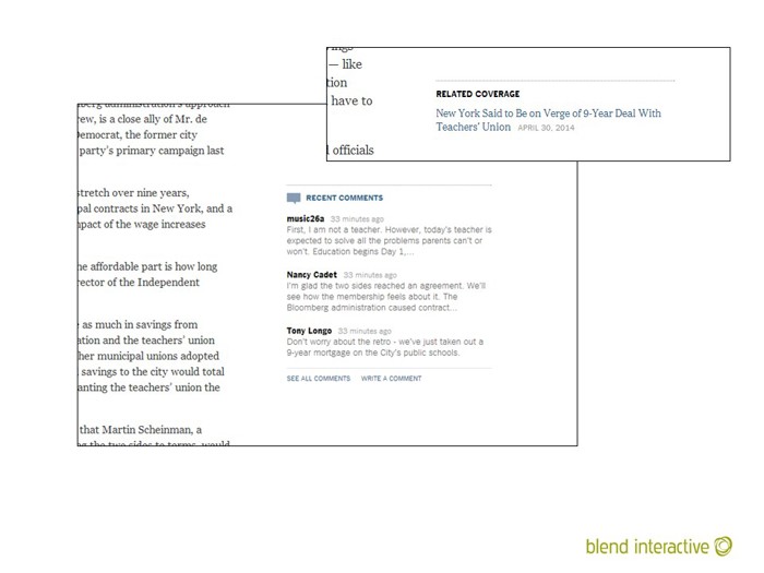
Another example of context. The “Related Coverage” and “Recent Comments” are likely in a central layout as well. They will need some information from the operative content object (an article of some kind, it seems) to know what to render.
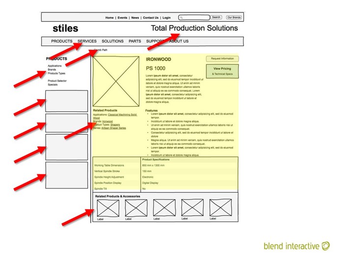
In this diagram, the operative content object is in yellow. All the arrows are pointing to things in the surround/layout that will require context.
(I have no memory of where this wireframe came from. If it’s yours, I’m sorry.)
I would ask this question about every element that appeared on a wireframe. If no one could tell me the answer, then I’d just cross that thing out.
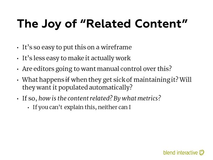
I have a pet peeve about Related Content. It’s so easy to shove it on a wireframe, but it can be really complicated to actually make it happen.
(Consider that Episerver acquired an entire company to provide functionality around related content. It’s not as easy as everyone thinks it is.)
Everyone in the organization gets seduced by sexy wireframes, long before they’ve been evaluated for implementation.
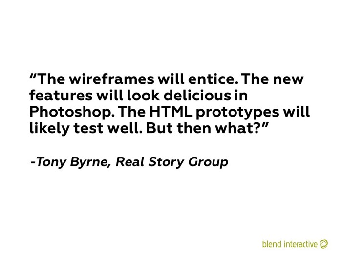
Tony says the best things. I loved this quote so much that I went on a rant about it.
Wireframes are an aspiration. You hope you can make the finished product look like this, but is depends on a lot of things, like the capabilities of your CMS, the condition of your content, and the skill of your editors.
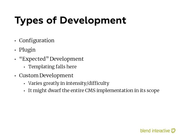
Not all development is equal. Some is expected on every implementation, and some is wildly specific to a customer’s situation.
I’ve written about this a few times:
- Checking the Box: How CMS Feature Support Is Not a Binary Question from 2011 is where most of this slide came from
- I talk about it more recently (2019) in Problems, Patterns and Why Every CMS Thinks It Knows What You Need
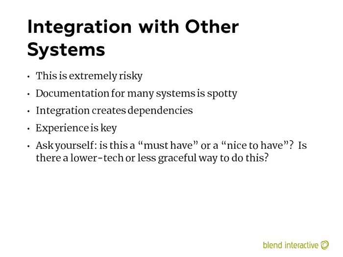
A lot of expense and time has been spent trying to make an integration “seamless.” People get irrational about it – they don’t want any visitor to know they’re using some other service. Sometimes it’s a wiser decision to just acknowledge the external dependency and show the seam.
External integration with an unknown system can be a black hole with no bottom.
So many times, we were asked to integrate with another system that no one really understood or had any documentation on. They just assumed it was possible.

